A Website Makeover.
Going responsive for the first time.
Created a low-fidelity wire frame. Then mocking up a design on Photoshop using a Bootstrap responsive grid.


The NLT Study Bible is one of Tyndale's bestsellers with over 250,000 units sold. In 2017, Tyndale decided that the NLT Study Bible's cover and landing page needed a fresh update.
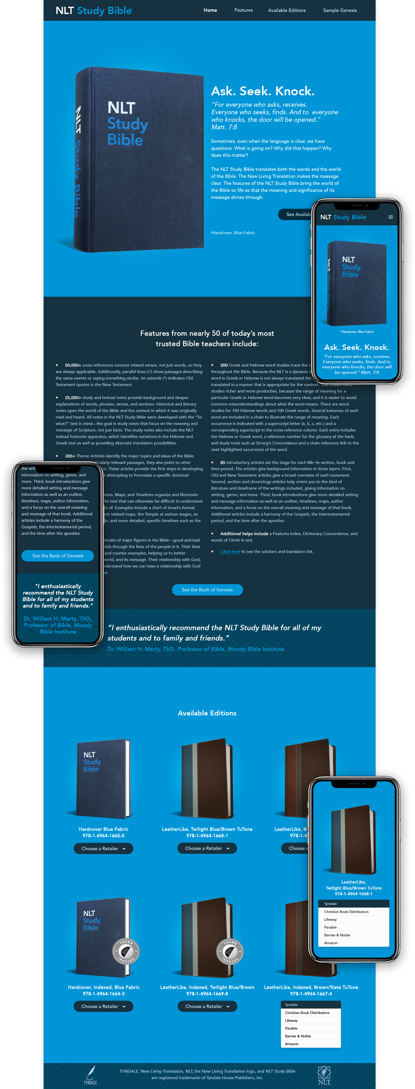
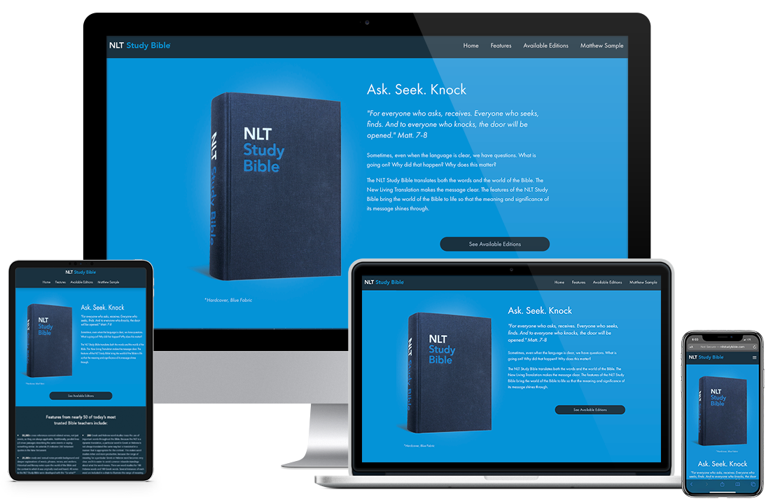
After the cover design team completed the NLT Study Bible's new look, the NLT Study Bible marketers tasked me to makeover the landing page. The old site was not responsive. So the marketer's immediate request was to design the new site responsive for all devices. Then, keep the blue color scheme and mimic the packaging box.
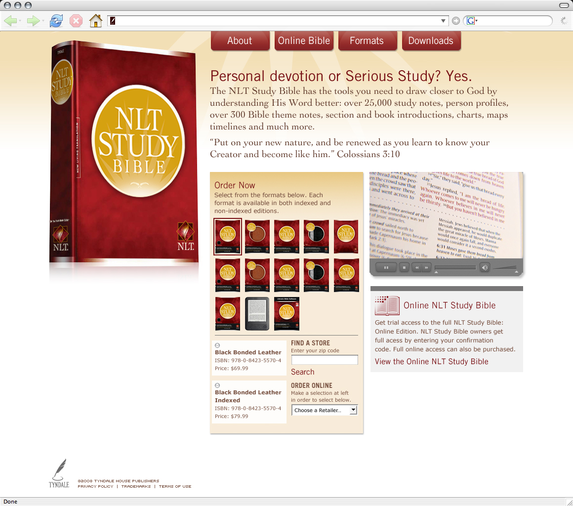
Out with the old! Designed in 2013, here is a screenshot of the retired cover and original landing page.
The cover design team recorded the new style guidelines on an Excel spreadsheet. I took that information creating a style guide.
From the Excel sheet, I picked up the font names & sizes, color codes, graphics and created this visual manual for myself.
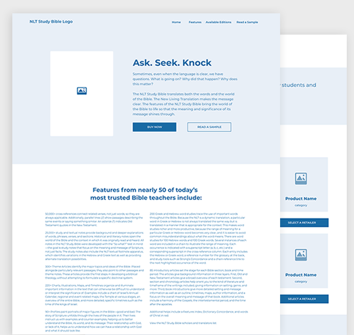
The marketers handed me three word documents having copy, a PDF sample excerpt and 3D graphics for the available editions. With the content in my hand, I began wire framing the landing page for desktop, tablet and mobile use.
The study bible marketers handed me three word documents containing light copy, a PDF sample excerpt and 3D graphics for the available editions. With the content in my hand, I began wireframing the landing page for desktop, tablet and mobile use.